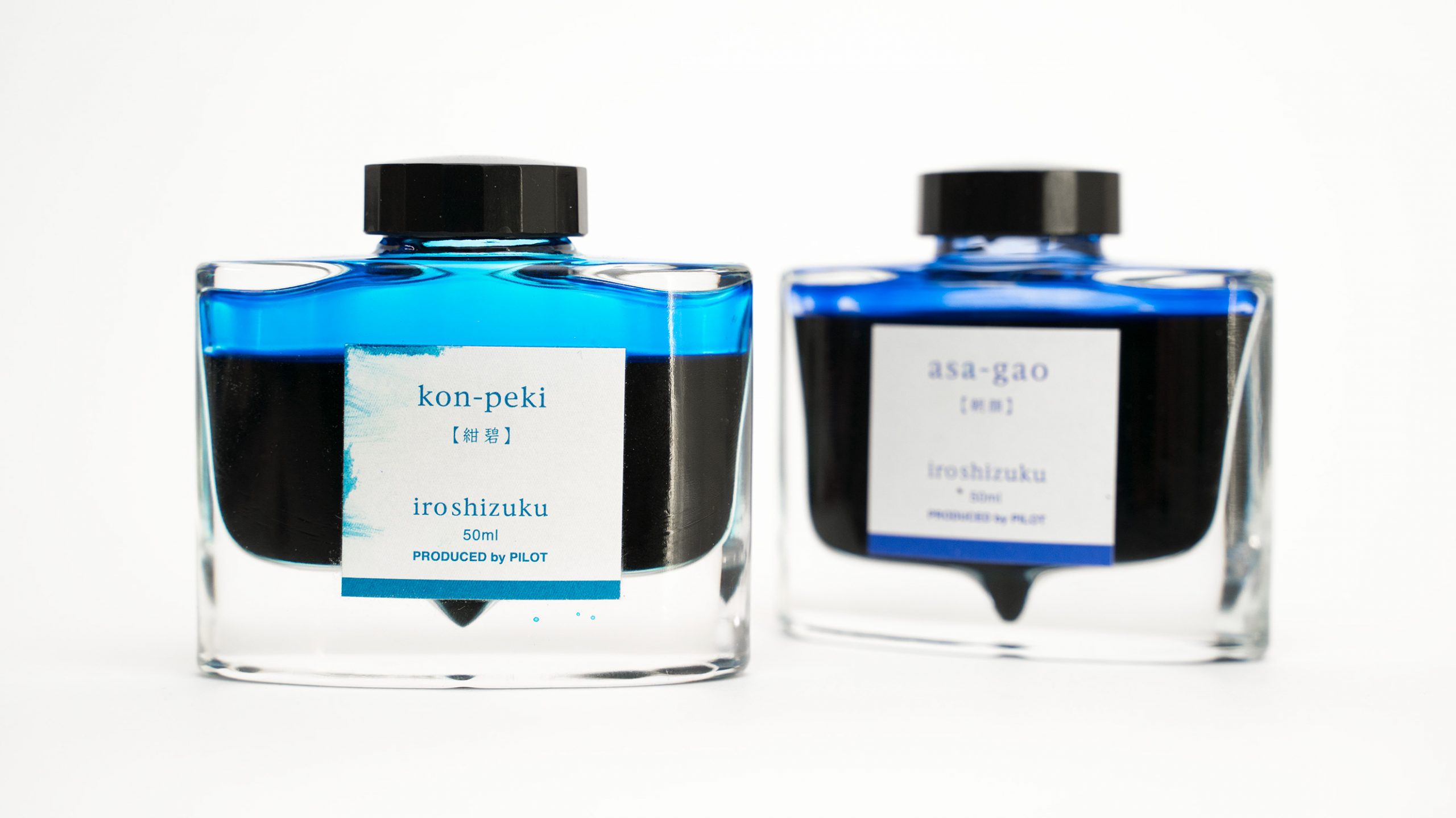
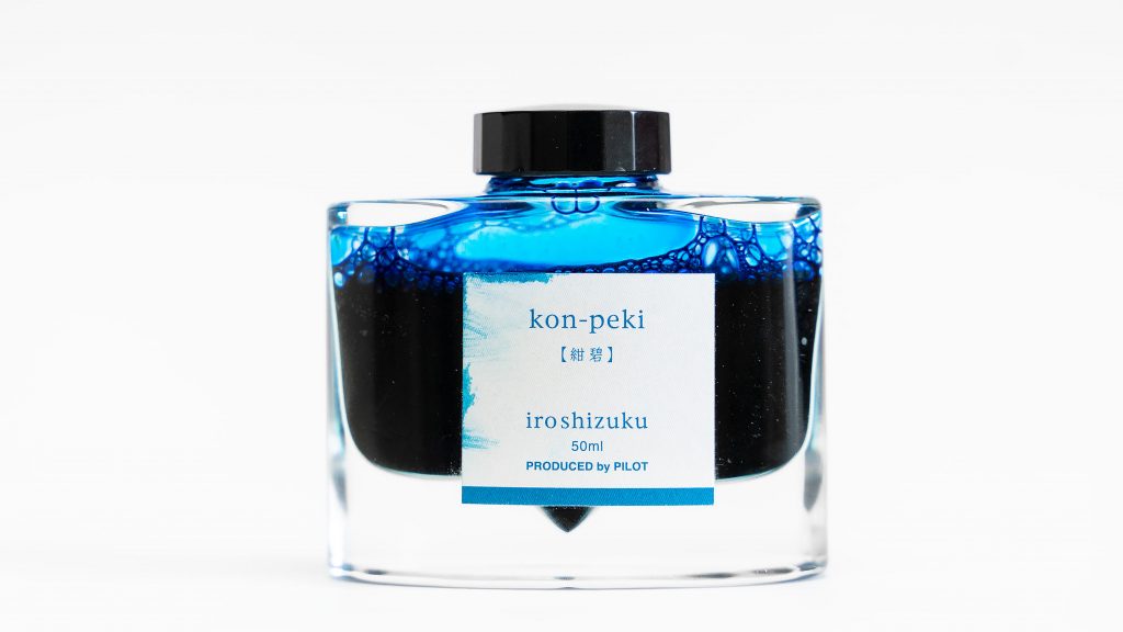
Kon-Peki was the first Pilot Iroshizuku ink that I ever purchased, and I’ll admit that a big part of my choice was the fact that the bottle is so gorgeous. That thick, heavy glass, the smooth curves, the ink well in the bottom center, the minimalist label… this is the sort of thing that makes bottled ink a joy to use.
I was also in the early stages of my blue ink obsession, and it was a toss-up between kon-peki and asa-gao (which I also love, now), but I started with the kon-peki because I wanted something that would pop on the page a little more, and it looked brighter, to me.
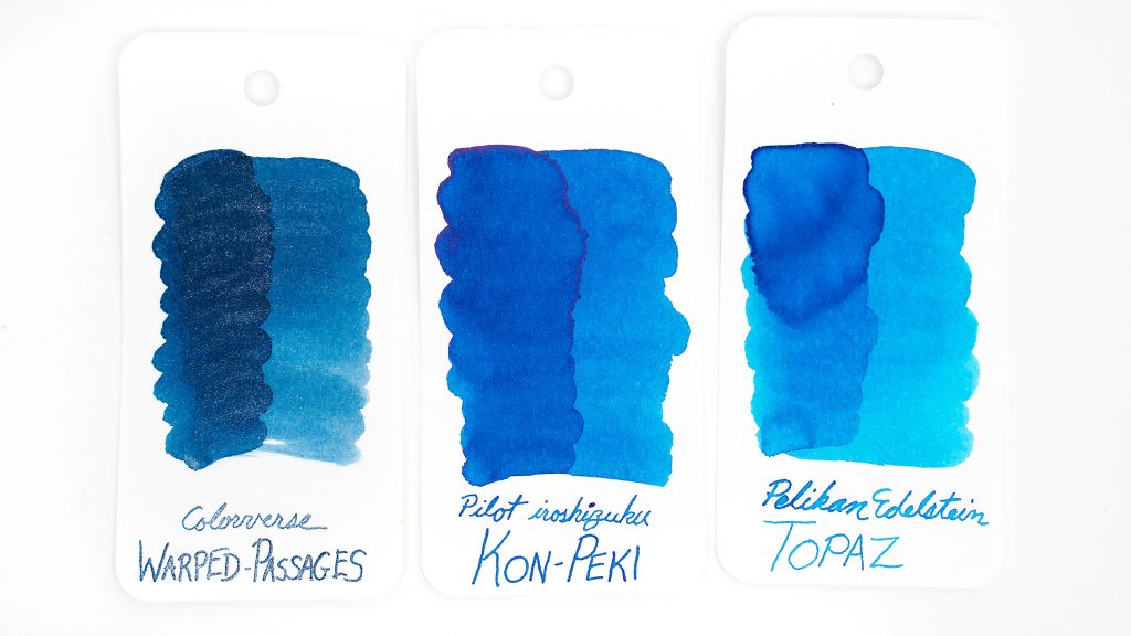
I didn’t actually love it from the start. I had been expecting a bright, true-blue, but I found that kon-peki leaned a little bit green. Looking at it now, it’s hard to understand how I ever thought that the tiny tinge of green was a problem, and I quickly learned to appreciate it.
Ink flow is on the wet side of medium. From a glass dip pen the ink seems pretty wet, but when used in any of my fountain pens, it seems just slightly on the wet side of medium. Dry time is also intermediate: around 20-25 seconds on Clairefontaine with a medium nib. On copy paper it dries nearly instantly, of course, but the feathering isn’t horrible, though there is some bleed-through on wet strokes.
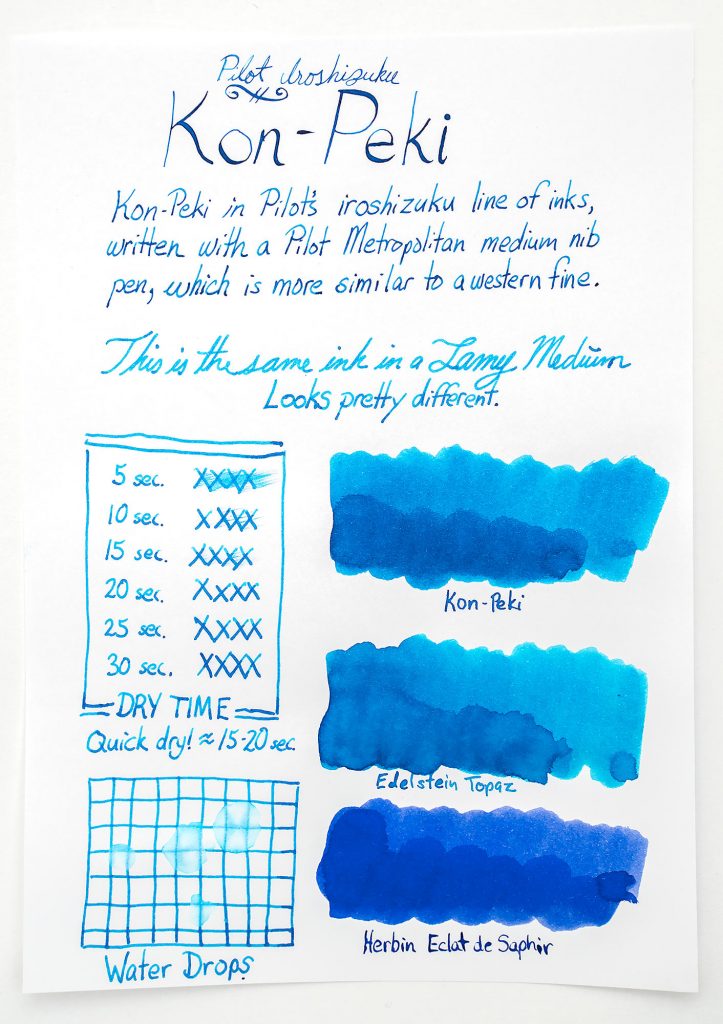
The color is saturated enough that I don’t get much shading in real world use; it is very evenly rich and smooth. However, when the ink pools a bit, it does develop a modest magenta sheen. I’ve never noticed it while writing, but it is clearly visible with a Q-tip swab on good paper.

Water resistance is minimal on good paper, though the ink does not disappear so completely as to be illegible. With a few drop of water, 50 percent of the ink disappears from Clairefontaine. However, on cheap copy paper, where the ink soaks into the fibers, water has a minimal effect.
After a couple years of using this ink, I really like it. It’s vibrant, flows well, and the color is a nice change from a standard blue. What do you think? Let me know in the comment section below!
