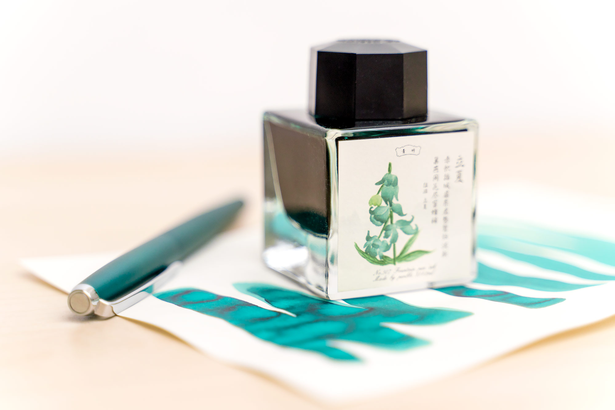
Among the haul of inks that I imported from China last winter were quite a few PenBBS inks, including six of the Season 27 inks in heavy, square glass bottles. All of these inks have botanical names, and this one, #507, is called Lily of the Valley. The resemblance of these inks to Sailor’s Manyo series will not fail to escape anyone’s notice, but I personally find that the label art on the PenBBS inks is quite a bit more attractive, with delicately colored and shaded illustrations and Chinese characters on an ivory background.
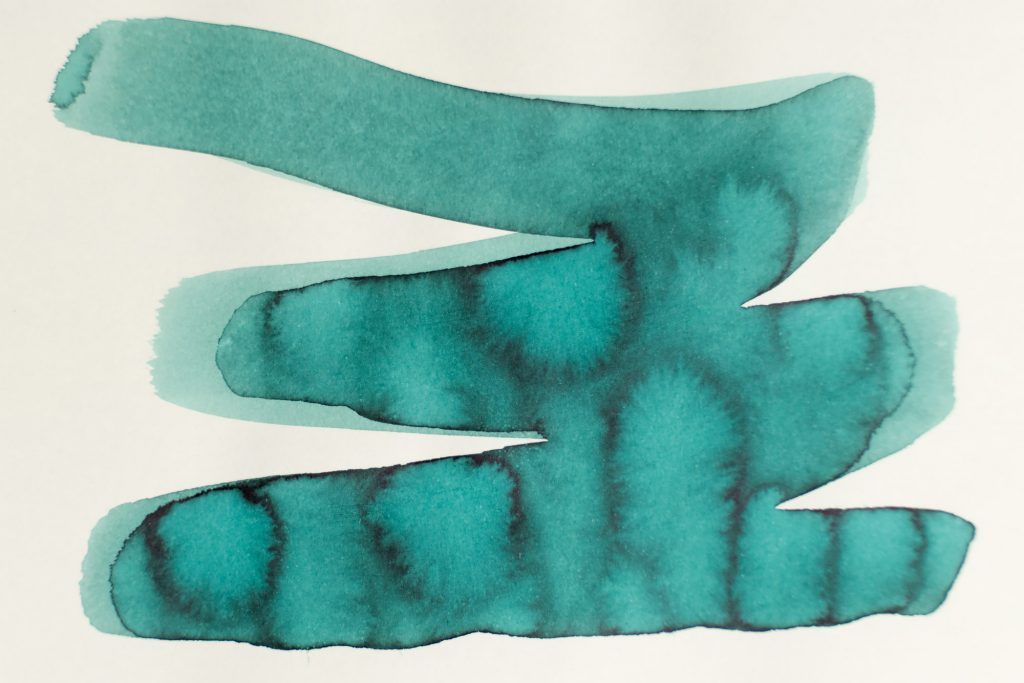
The ink itself is a very light teal or, in thinner applications, a dark mint-green, but it shades nicely, getting nearly black in heavy areas. I generally think of this as a pale ink, though, and it only gets darker when a large nib is used, when writing.
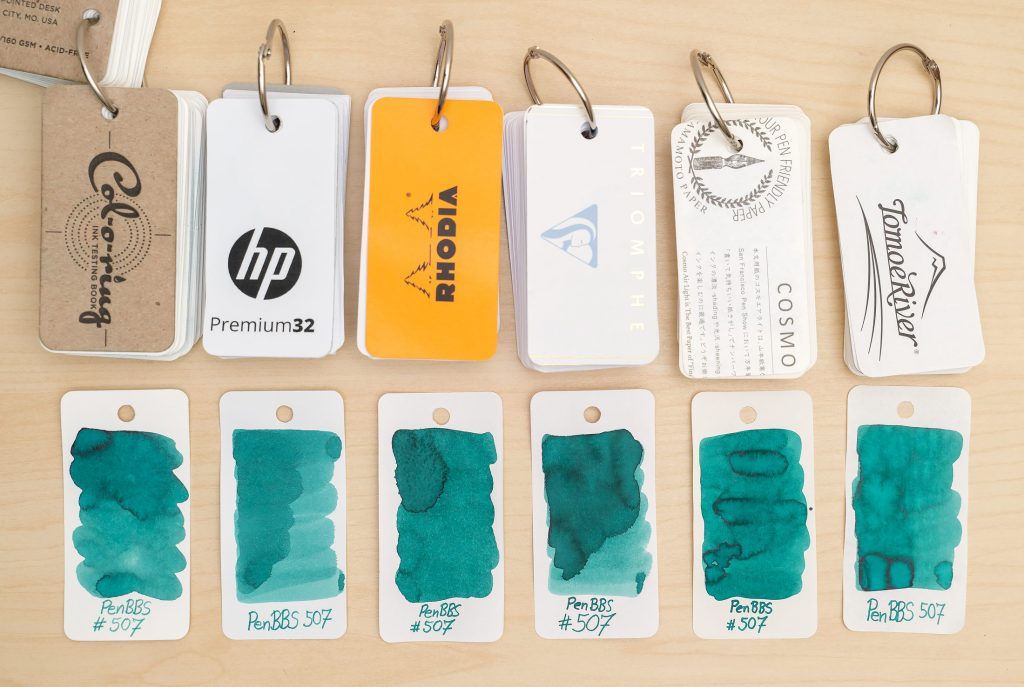
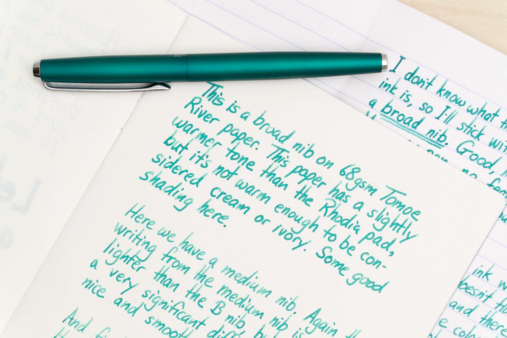
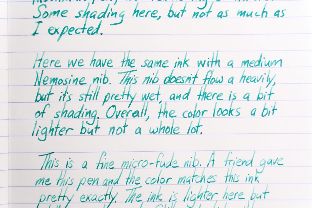
As you’d expect, it looks a little more green on warmer toned papers like Midori, Cosmo Air Light, and even 68gsm Tomoe River. Looking at the swatches above, the lighter tones on the HP paper and the Triomphe represent the color of the ink best. It’s pale.
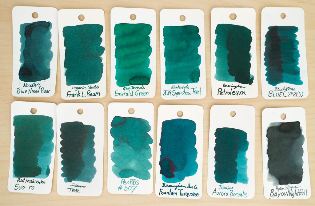
Here’s a darker swatch compared to some other greenish colors that I own.
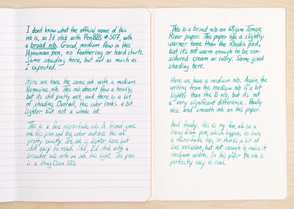
In normal, day to day writing, you’ll want to use a this ink in a pen with a broad nib or a western medium nib, since the pale ink does not always show up well with a fine nib. Otherwise, it does not have any significant problems: it dries moderately quickly and does not feather or bleed through the paper. Flow is very average.
What do you think? Like the color? Think it’s boring? Let me know!
