In all of my time in India I somehow failed to encounter Krishna inks, which is unfortunate because they offer some very unusual and beautiful inks, and they’re on the expensive side (by volume) in the USA.
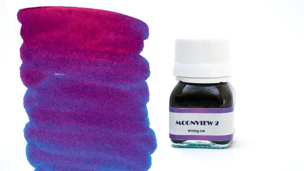
Moonview 2 is the higher-sheen formulation of their popular ink, and it is enchanting. The base color is a deeply saturated blue leaning toward turquoise, but the sheen is heavy enough that even when you’re writing with a standard fountain pen, your writing will look more purple than anything else.

The shading is, consequently, hard to see most of the time, but I do get a modest amount. The saturation is high enough, though, that the ink is mostly pretty uniform; it is only when the ink is drawn out thin with a swab or a drying nib that the greener tones and shading begin to appear.
I like to use sheening inks with an Fountain Pen Revolution Ultra Flex Nib (which come in a standard #6 size and can replace lots of stock nibs, and are the best I’ve found so far), and Krishna Moonview 2 does not disappoint. Each loop shines like a jewel when the light catches it, but in subdued light, it is a very attractive blue.
Flow is very good; the ink seems a little thick but while it’s nice and wet, it’s not sloppy wet. It may be the apparent thickness that helps prevent railroading in my flex nib.
On Clairfontaine Triomphe paper, this is not a quick drying ink, but even when I put down a heavy flex line, it doesn’t bleed or feather, so I don’t mind being a little more patient. As you can probably tell from my test sheet, I expected the dry time to be worse than it was; it was generally dry after a full minute, with some thick stragglers requiring an extra 20-30 seconds.

As is the case with most sheening inks, Moonview 2 offers no water resistance, so I don’t recommend it for addressing envelopes or for scientific field notes.
This was my first high-sheen ink, so I can’t offer much in the way of comparisons. Diamine’s Majestic Blue and Private Reserve’s American Blue both sheen a little for me, but don’t begin to compare to Moonview in that regard. The base color of Moonview is a little greener than both, too.

Some may prefer a little less sheen than you’ll get with Moonview 2, and the original formula is still available for them.
The packaging of this ink is my only real complaint. The bottle is utilitarian, at best; it reminds me of a medicine bottle more than anything else. There is no shortage of fancy attar bottle manufacturers in India, for example, and I’d like to see something unique for these beautiful inks. I’m not a fan of the plain-paper label or even the typeface used, and I’d prefer the ink to ship in a larger bottle. The box is a bit better, with a good splash of color, at least.

Still, I do buy the ink for the ink, and when all is said and done, this is one of my favorites.
What do you think about Krisha inks, or Moonview 2? Let me know in the comment section below!


