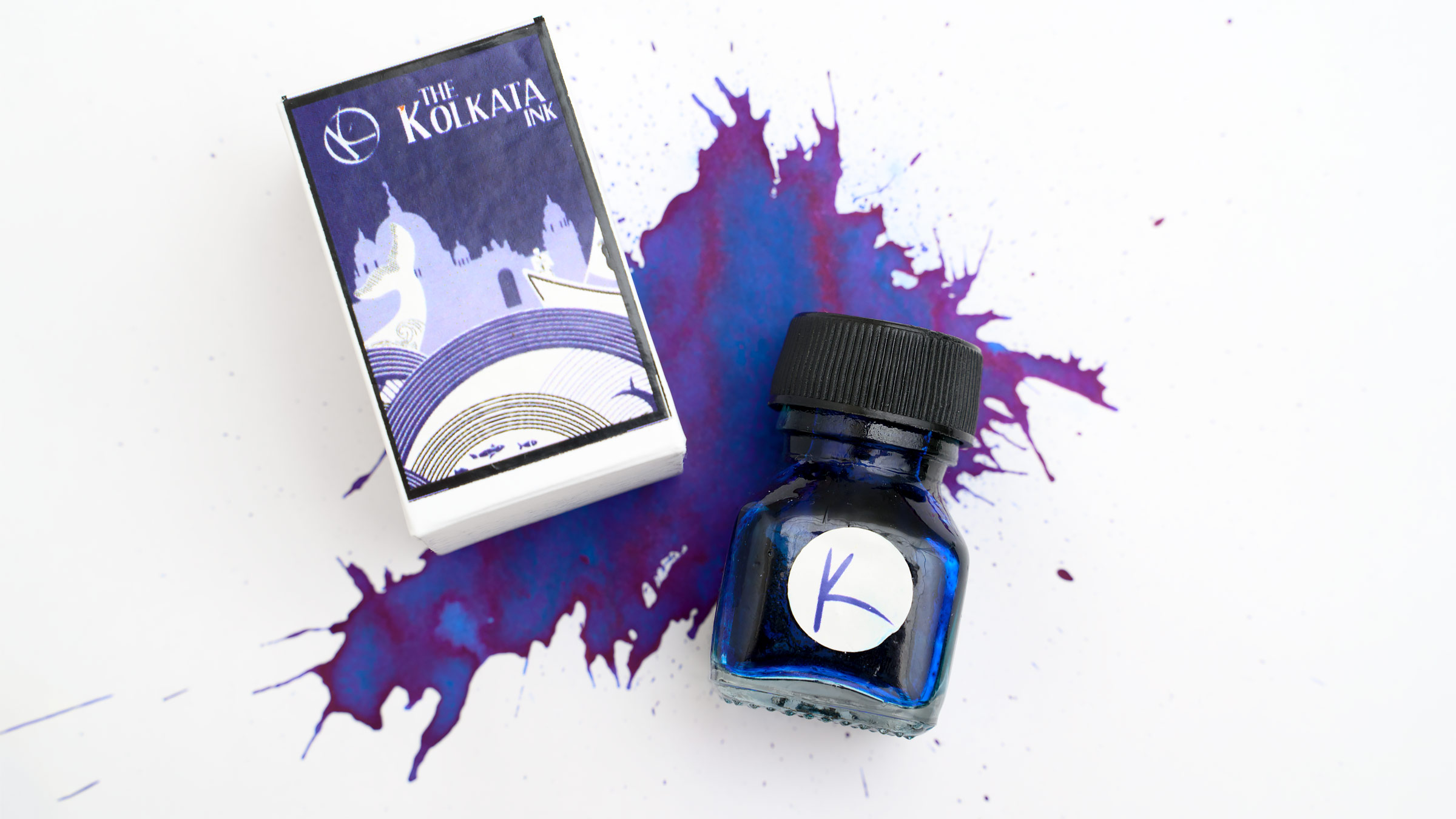
At the moment, this ink doesn’t seem to be available in the USA, but we are able to order it directly from India, and if you’re a fanatic for blue inks like I am, it will be worth it. I paid about $9 for this bottle, plus shipping. These small glass bottles hold 20ml.
Krishna Ink has a variety of different ink lines, but the relatively new “India” series only represents three cities at the moment: Delhi Mumbai (aka Bombay), and now, Kolkata (aka, Calcutta). Mumbai is a sheening red ink and Dilli is a sheening purple, so I was a little bit surprised to find that the label on the new box for Kolkata was also a purple-leaning indigo. Two inks out of three are purple? No, it turns out.

Krishna Kolkata is a medium blue ink, leaning slightly green, with moderately heavy red-magenta sheen. The combination of the blue base color and the reddish sheen creates an overall impression of purple, which explains the label color.

In large, thick splatters of ink, the Krishna Kolkata is a dark blue with red sheen, and is quite a bit darker than the standard ink swabs appear.

As usual, I swabbed the ink in all of my DIY swatch books with different papers, including Tomoe River, Cosmo Air Light, Rhodia, Clairfontaine, and HP Printer paper. Here, the Rhodia is the most neutral toned paper, and also the least likely to sheen (though it sheens well compared to copy paper).

In order to get a better idea of the color without the influence of the sheen, I diluted the Kolkata with water at three different ratios, 1:2, 1:3, and 1:4. The different ratios made almost no difference, but they were all enough to show the hue of the ink without sheen. As you can see, it’s not unlike Pilot Kon Peki, though Kolkata sheens more. It’s similar to Blackstone Barrier Reef Blue (no longer available), and it’s slightly greener but otherwise similar to Diamine Royal Blue.

I own several bottles of Krishna ink, and in general, they tend to be a little on the thick side, but they’re usually well behaved on lower quality papers. This holds true with the Krishna Kolkata: it doesn’t feather at all on my HP printer paper, and I get some shading and can even get some sheen in very heavy areas.
Here are some of my writing samples on un-ruled Tomoe River paper and lined Rhodia.

I’d consider this a moderately dry ink. If I write with my glass pen, I get a thin, even line (while some inks will gush onto the page or glob down heavily at first), but it flows better than my Pennonia multi-shading inks, which are solidly “dry” inks. It works nicely in flex nib pens that have enough flow (there’s no railroading), but because the ink does now flow quickly, I do have to write slowly or risk running dry temporarily.
Krishna Kolkata does not exhibit any water resistance.
What do you think? Is it a color you like?
I’ve become a big fan of Krishna inks over the past few years, especially after spending some time in India… there’s something nostalgic about them for me; they remind me of the vibrant colors and people of India. I do wish that these inks came in bigger bottles.
Let me know what you think about Krishna inks in the comment section below!


