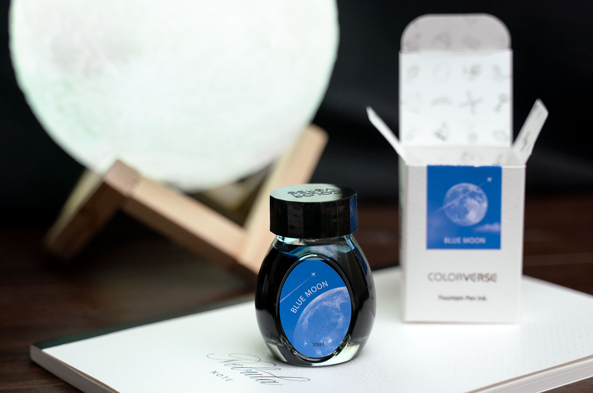
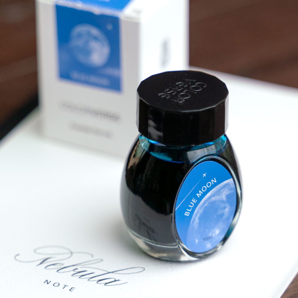
Following the theme of my recent acquisitions, I bought this bottle of Colorverse Blue Moon from Goldspot Pens because it is an exclusive offering from that store. Like many Colorverse inks, it ships in a 30ml bottle with cool moon-themed graphics.
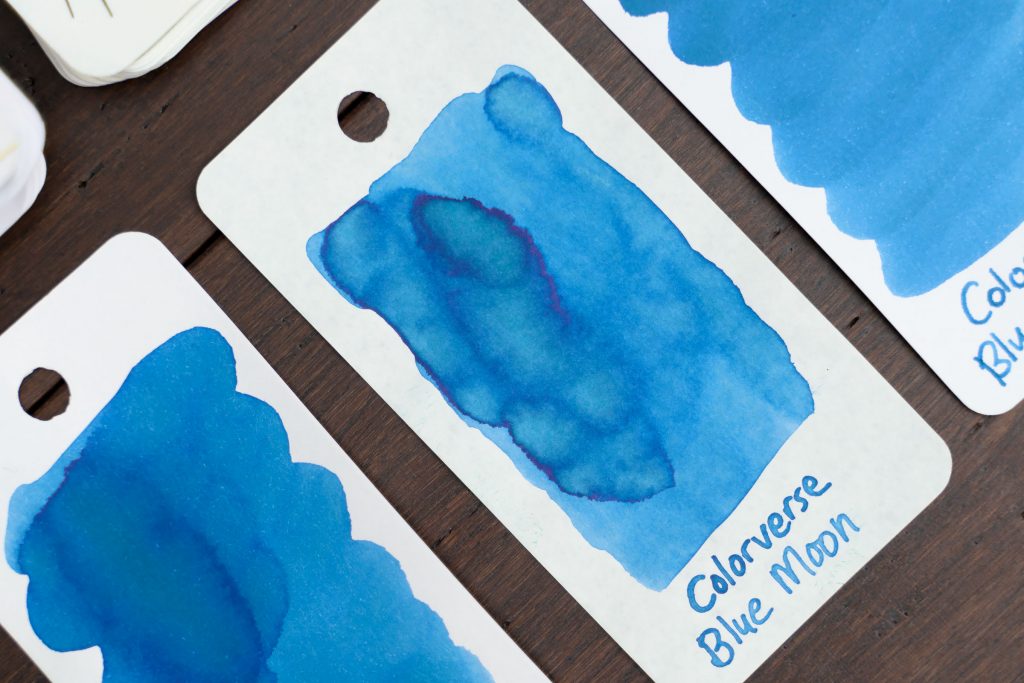
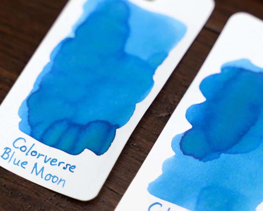
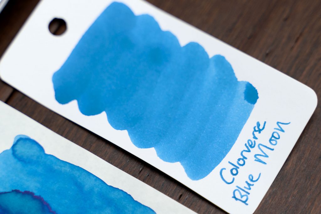
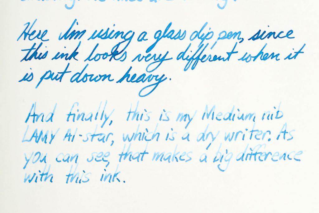
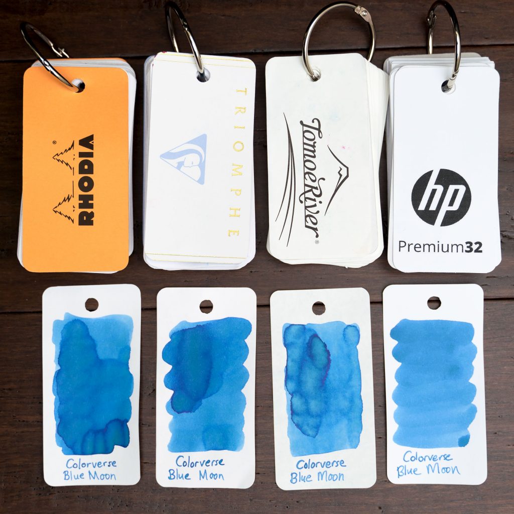
The ink itself is a pale blue that has green shading, though it’s not usually noticeable in normal writing. Like most Colorverse inks, Blue Moon is a well behaved ink, showing no feathering on any but the worst papers, no bleed through, and no problems with hard starts. The ink has medium-dry flow, and when coupled with a dry pen, it produces heavy shading as a result (since the bulk of the strokes are very pale).
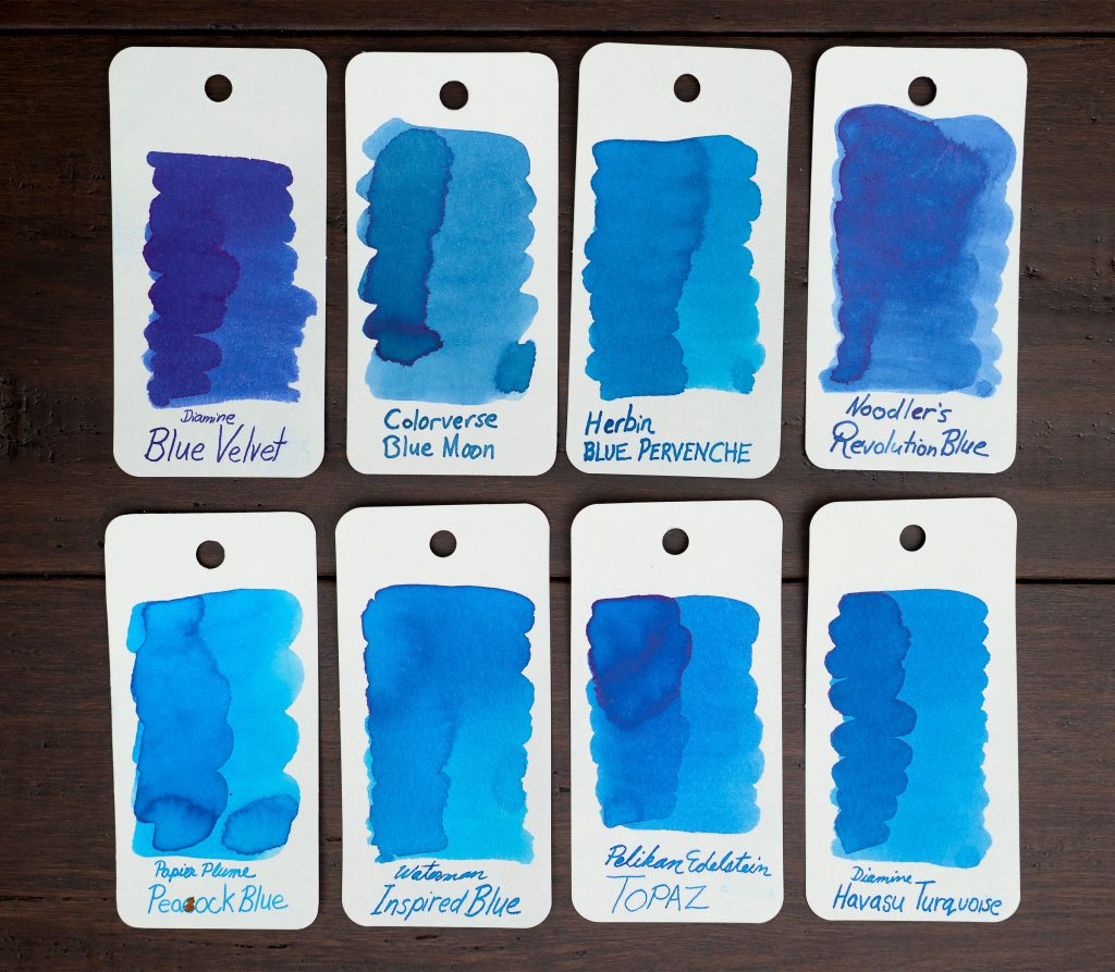
Although I have several light or pale blue inks, they’re all more green than Blue Moon. Herbin’s Blue Pervenche is similar but more saturated and more turquoise then Blue Moon.
In fact, I’d say that Colorverse Blue Moon is more blue than it appears in all of my photos; the sRGB color gamut might not have space to show the difference… or perhaps I’m making a mistake in my color correction.
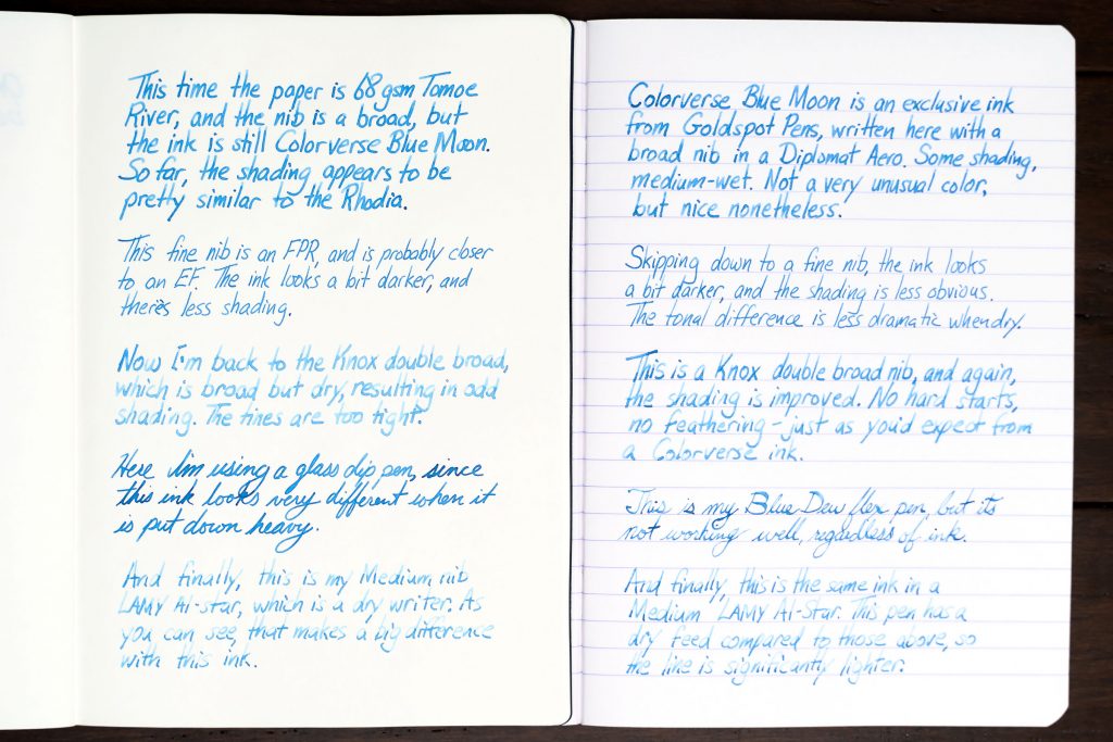
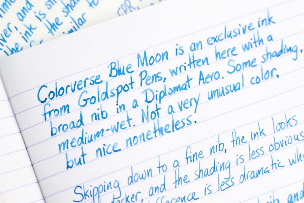
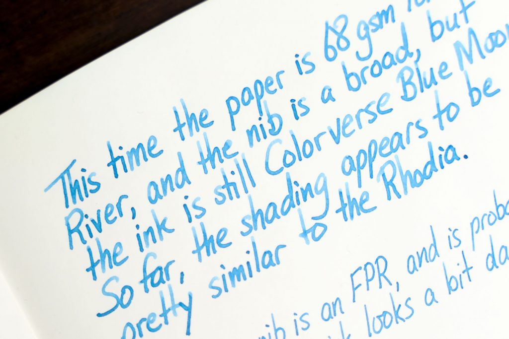
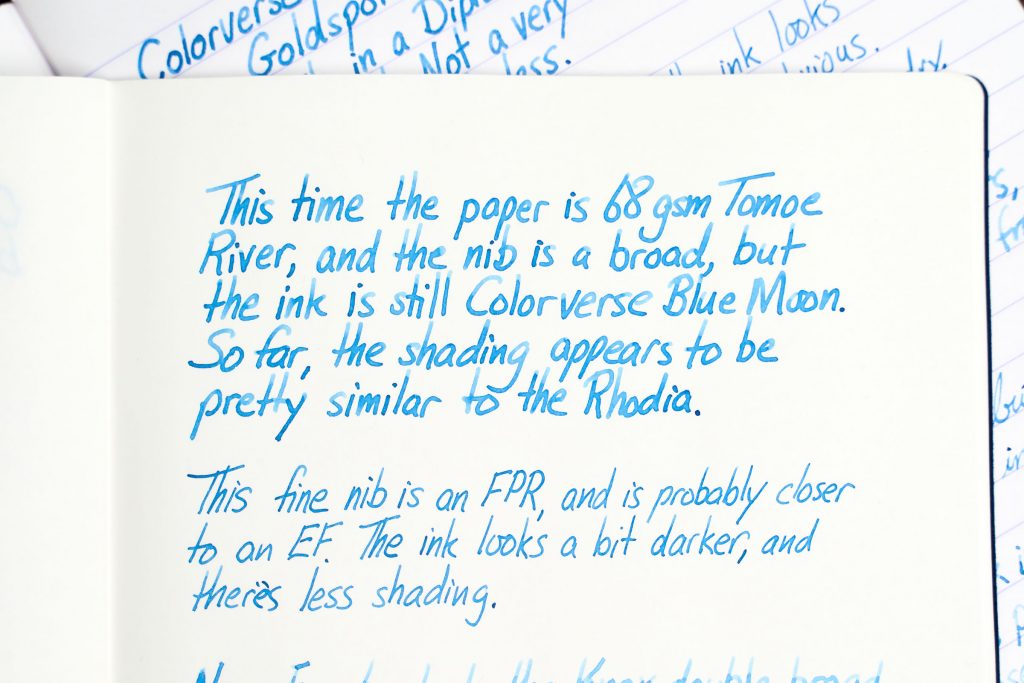
In my writing samples on unruled 68gsm Tomoe River and ruled Rhodia, you’ll see that when I write with a wet pen, the Colorverse Blue Moon appears to be a pretty regular, medium blue ink with a little shading. With dryer pens, though, the shading really gets dramatic, but at the cost of legibility.
And that’s about it. Overall, I like the ink, but it’s not outstanding. It reminds me a lot of Montblanc Chinese Blue or Montblanc “Blue Hour” Twilight, but paler. I find both of those inks to be more to my taste, but I’m pretty happy with this one, too, and it’s a lot less expensive at $16 per bottle.
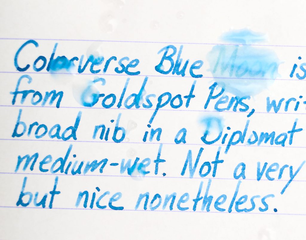
Oh, and it’s not water resistant. Here’s one of the writing sample pages on which, after a day of drying, I splashed a few drops of water, and I photographed it about 30 seconds later.
