Berlin Notebook, Blue, Inks
Berlin Notebook Blue No.1, Standard & Black Label Review
Last year I bought a Cognitive Surplus notebook because it had a cool looking beetle on the cover, but didn’t really stop to notice that the paper inside was recycled and not at all fountain pen friendly. I didn’t want it to go to waste, though, so I started looking for a vibrant blue ink that wouldn’t feather and bleed all over the place like BayState Blue does on cheap paper. And I found Berlin Notebooks (recycled paper) and the ink that they make to write on them… Berlin Notebook Blue No.1 and No.1 “Black Label”.

Black Label is supposed to match the color of the original, but without the sheen (for those who prefer non-sheening inks). This is a non-issue if you’re actually writing on recycled paper, since neither sheen there, but there are some differences in sheen on higher quality paper.
Packaging
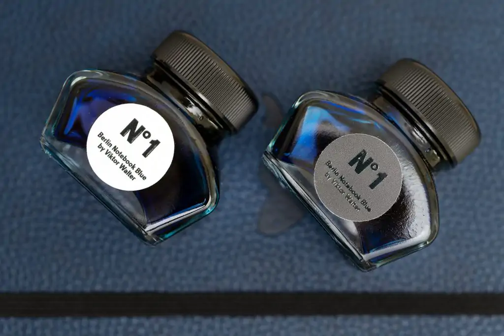
Berlin Notebook Blue No.1 can only be purchased directly from the company website, and the ink is shipped from Germany. The 30ml bottles cost 12 Euros each, and the shipping is reasonable. Labels are simple, clean, and attractive, in a German sort of way. Each bottle arrives in a small brown box with a round label sticker that matches the one found on the ink bottle. I like them… especially the black on black of the “Black Label”.

Color & Sheen Differences
As expected, the two inks are relatively close in color. Black Label is a little darker, and the original might have a touch of green in it, but that’s debatable.
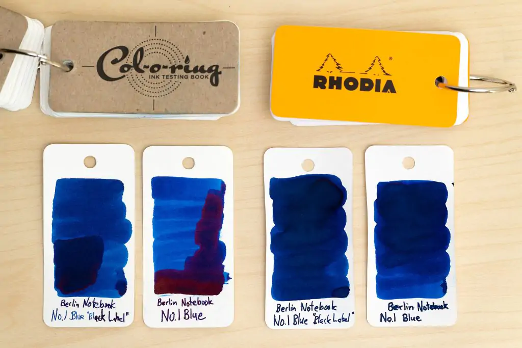
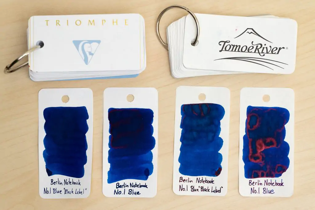
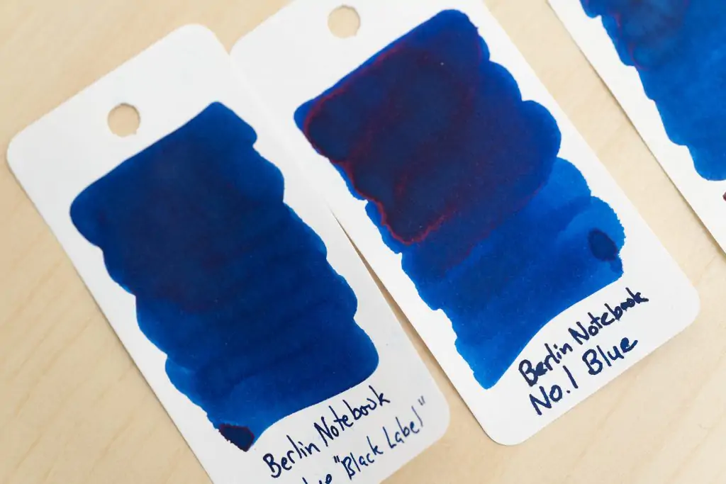
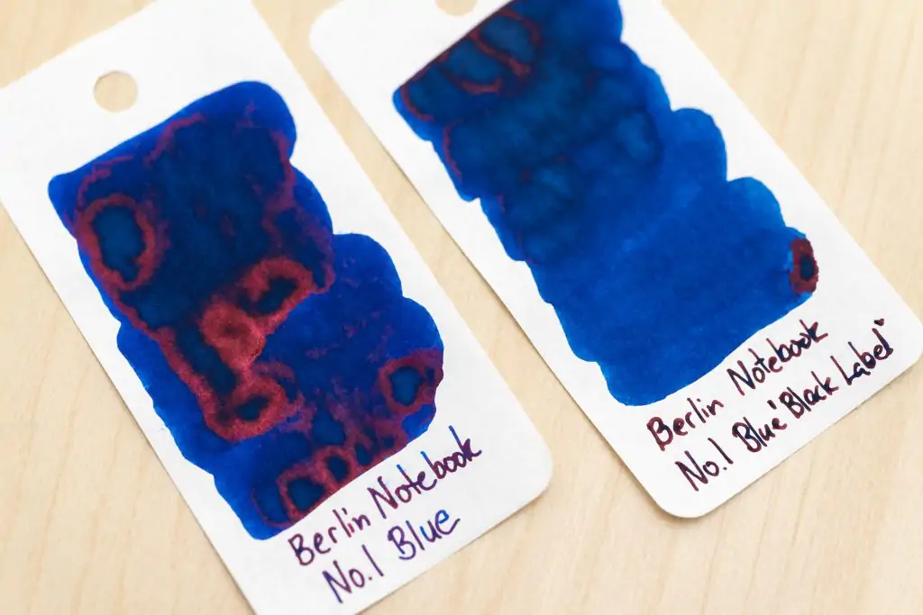
The most obvious difference is in their sheen. Neither is a super sheener, but the standard ink does produce a fair amount of red sheen when used on papers like Tomoe River. Interestingly, neither ink sheened heavily when I swabbed them on Rhodia paper, but when actually writing on Rhodia, I do get sheen from both.
The Black Label’s sheen is not as bright and vibrant when it does sheen. Rather than red, its sheen is more of a dull bronze tone.
There’s nothing particularly special about the color of these inks otherwise. They’re both a good, solid medium blue, moderately vibrant but not as much as BayState Blue or even Monteverde Horizon.

When Writing
Both of these inks are well behaved, without any problems with feathering or bleeding, even on cheap recycled paper, which is probably the only reason that I’d recommend getting them over more easily available inks. However, they are terrible when used in flex nibs: they railroad at the slightest sign of flex. Otherwise, flow is about medium.

With a broad nib or stub, the color of the ink comes through nicely when writing, but it appears quite a bit darker on medium and fine nibs, with only the thin areas of ink popping with vibrant blue. At the same time, the heavier areas of ink get quite dark and sheen with a dull bronze tone, creating a blue to brown effect, which is actually pretty cool looking. The bright blue areas of each letter pop enough that the effect is a bit like glistening dew on the darker letters.


And here are a couple of quick samples of Berlin Notebook No.1 on recycled paper from Cognitive Surplus. As you’ll see, there’s a little feathering and a touch of bleed-through, but it’s not dramatic, especially for recycled paper.


What do you think?
Would you consider buying either of these Berlin Notebooks inks? I’m moderately happy with them, but not overwhelmed. I probably wouldn’t recommend them to my friends over anything else, but there’s nothing wrong with them, and they do handle cheap paper pretty well.

Thanks for the great review. I just got my two bottles of the “white” and “black label” of Berlin Notebook No. 1. I really like the company – even though they’re so small, they don’t even fall under the German VAT act, their shop is very professional, and you can easily tell how compassionate and creative these people are.
But this is about the ink, not the manufacturer, and for that I agree with nearly all you said about it: It’s a little too dark to be impressive for my taste. I used in in a Montblanc 149 with e fine nib and a vintage Montblanc 146 with a broad nib, both on Brunnen paper. There was no visible sheen in both inks used with that layout.
The really good thing to say is that the ink flows very well. Both pens I used don’t get along well with “dry” inks, and with Montblanc’s own ink they’re no fun to use. Both pens work well with the Berlin Notebook ink.
Concerning feathering though my experience was quite different to yours. With both pens I had more feathering than with any other ink I’ve ever used. And I’ve hardly ever had any trouble with feathering on the Brunnen paper. Also the ink bleeds like nothing I’ve ever used. Private Reserve’s American Blue as well as their DC Supershow Blue used to be the strongest “bleeders” in my ink collection. But this ink bleeds so much on the Brunnen paper, with the broad nib it stains the sheet underneath.
Maybe this ink works great when used with a very broad nib or a brush on high quality paper like Tomoe River. But for my kind of use with household nib sizes on mediochre paper it doen’t really meet my high expectations. It’s a recommendation for pens that don’t get along with “dry” inks. But in the end … Any of the blue inks by Pilot Iroshizuku do a better job in almost every aspect – their colors are nicer for my taste, they flow just as well, there’s no feathering or bleeding. But they’re nearly three times as expensive as Berlin Notebook’s inks.
Ahh, that’s very interesting. It’s been a while since I’ve inked a pen with Berlin Notebooks ink; it sounds like it might be worth testing it again on some common, everyday papers. Sometimes, with smaller ink makers, ink properties can vary from batch to batch, so perhaps that’s another possibility here. I’ll update my post with more writing samples shortly.
I just uploaded a couple of photos of Berlin Notebook Blue on recycled paper. I’m getting a little bit of feathering, but compared to other inks I’ve tried, it’s not too bad. It’s also not particularly good… and some random inks are even better. Noodler’s Baltimore Canyon Blue feathered less, and TWSBI Midnight Blue was no worse than the Berlin Notebook Blue.