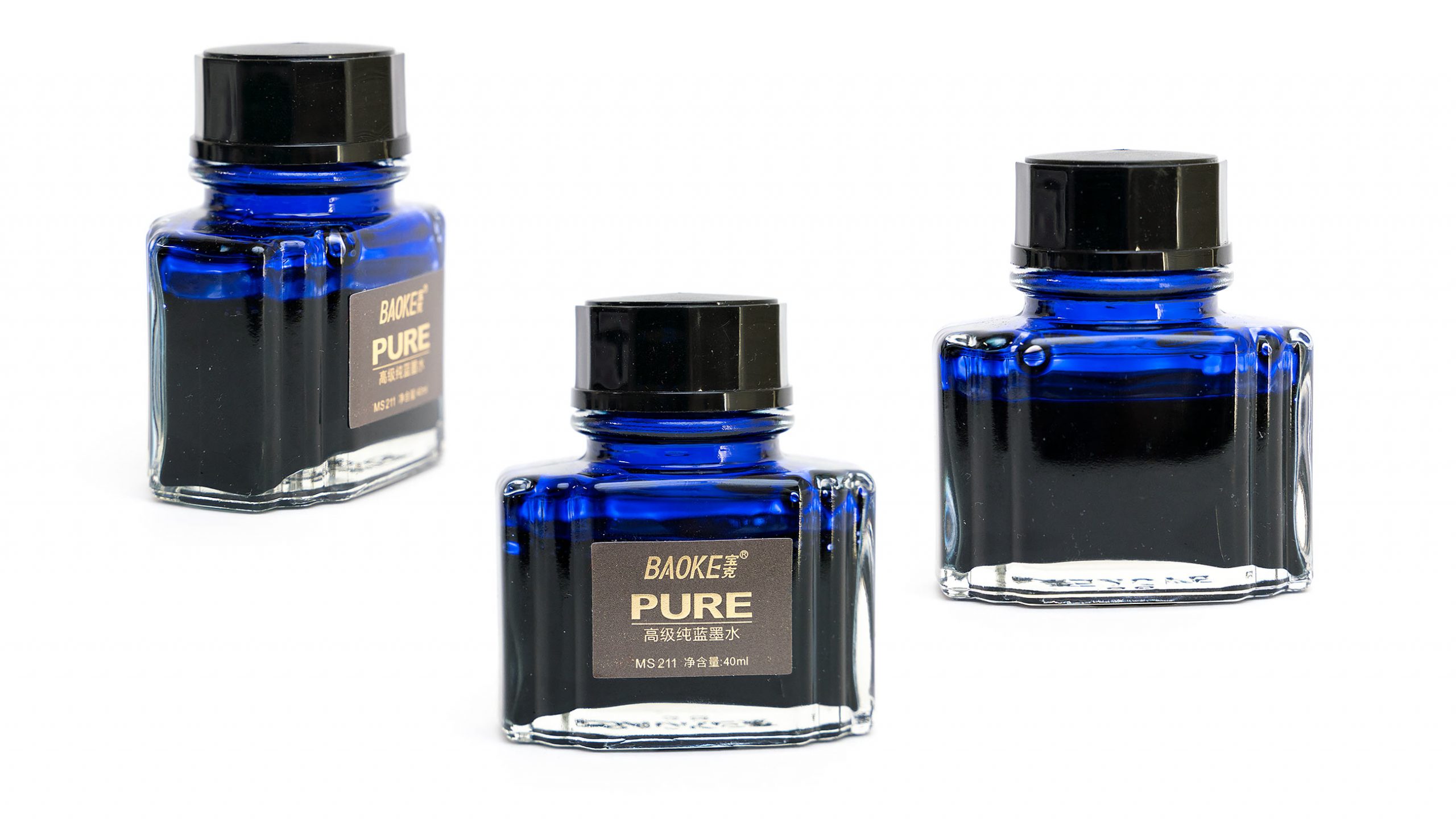
I was in India just over a year ago, wandering around a high-brow shopping district in Delhi. I’d been in the country for several weeks and was out of ink, and I was just looking for any bottle of anything. I stepped into an art-supply shop and asked for ink, hoping for something interesting… and the woman directed me to two different bottles: a small, non-descript jar of something un-labeled that cost about fifty cents. The other was a nice looking blue bottle with art-deco design, which she recommended. When I asked why, she said that it was because it was a high quality Japanese ink. It cost $3, so I took it. If I’d been in the throws of my obsession, I’d have taken both.
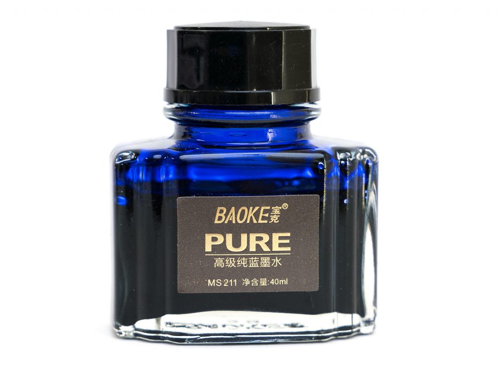
Anyway, when I got back to my room later that day, I gave it a closer inspection and noticed that it was not Japanese at all. The gold-foil characters on the label were, in fact, Chinese. So, there’s that.
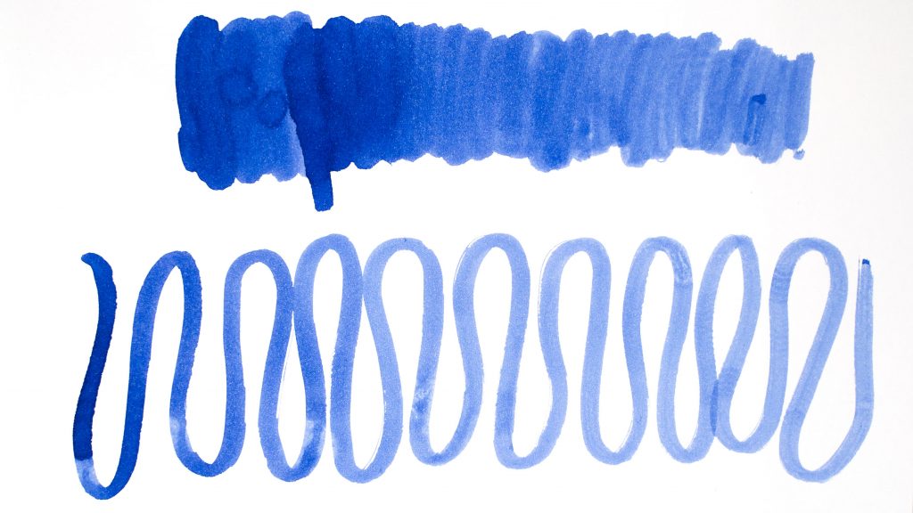
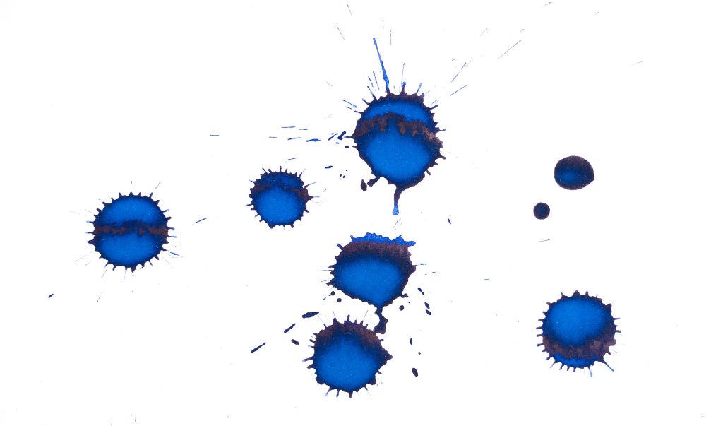
But I loaded into my pen (a Cross Bailey, Medium Nib) and gave it a try, and it was a pretty decent blue ink. It’s similar in hue to asa-gao or Eclat de Saphir, but not as saturated, and just a touch to the purple side. When I dripped a bit on some paper to see how it would dry, at first I thought that it had a sheen, but it turned out to be just a dark black, shiny area… does this ink have a black sheen?
Anyway, it’s not an especially wet ink; I’d say that it’s a little on the dry side of medium. Shading is pretty strong. It’s not water resistant at all, and it dries moderately quickly on most papers, but around 20-25 seconds on this Clairefontaine Triomphe.
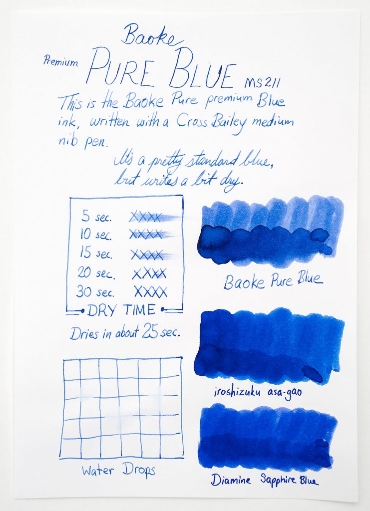
For the price, I was very happy with it at the time. Now it’s mostly just a nice little souvenir from my time in Delhi, but I wouldn’t hesitate to use it if the need came up for an ink with better shading than some of my other medium blues.
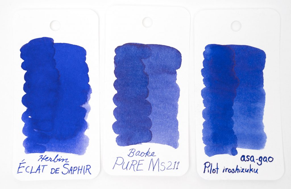
What do you think? Let me know in the comments below!
